
This post comes from our colleagues at Data You Can Use in Wisconsin.
By Sarah E. Laurent, MPH and Dr. Victor Amaya, PhD
Certain communities within the City of Milwaukee have been disproportionately impacted by systems of oppression which have resulted in the inequitable distribution of resources.
Data You Can Use is a non-profit organization located in Milwaukee, WI that focuses on “democratizing data.” We do this by connecting community partners with data and helping those partners use the findings from data analyses to guide strategies and understand the impact that data can have within their own community.
Data You Can Use seeks to provide resources to community partners in a format that is easy to access and directly applicable to the work being done to make Milwaukee a better place. Working with our partners, we recognized the need for readily available data and data visualizations on key indicators throughout the City of Milwaukee (MKE). As a result, in collaboration with the Community Development Alliance, Data You Can Use created the MKE Indicators Project. The project was first launched in 2019 at Data Day, an event hosted by Data You Can Use which brings together community partners and local leaders to share data resources and applications. The first round of the Milwaukee Indicators Project included 22 indicators across four overarching categories including Equity and Access, Population, Health, and Market Value in a “flat map” format.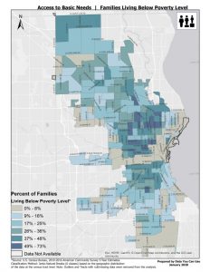
These maps were created with the ultimate goal of helping community members, planners, policy makers, and neighborhood organizations explore and document information about their community to support future planning and resource allocation needs.
The second round of the Milwaukee Indicator maps have now been updated to an interactive platform which allows users to examine the distribution of indicator values at a finer geography. Additional features have been added to the updated maps, including neighborhood census tract boundaries, as well as search, share, and print capabilities. The interactive features allow users the opportunity to explore data within a specific geography (for example, within their own neighborhood). We also added a new category to the updated Indicator maps, Equitable Housing, which highlights six new indicators on equitable housing features, including African American homeownership, Latinx homeownership, rental housing cost burden, access to broadband, access to healthy food, and access to parks.
Over the past six months we have hosted a series of workshops, one for each category of indicators, which provided community partners and local stakeholders the opportunity to learn more about the MKE Indicators Project and the new map features. This experience provided an opportunity to connect with individuals from a variety of different backgrounds, including non-profits, community organizations, health care organizations, government agencies, educational institutions, and many more. Through these workshops we were able to hear from community partners about how they plan to use the maps to support their work and how the project could be adapted to better fit the needs of the community.
We hope that through the MKE Indicators Project, specifically by connecting these data to the community, we can address inequities and bring awareness to the needs of different areas throughout the City of Milwaukee. Our hope is that the updated MKE Indicator maps can be used to guide decision-making and resource allocation throughout the City of Milwaukee with the ultimate goal of improving the well-being of Milwaukee citizens, particularly those who have been disproportionately impacted by systems of oppression.
If you have any questions or would like to learn more about the MKE Indicators project, please contact us at [email protected].
Interested in learning more about data visualization? Check out this training from the RVPHTC: